Assets, colors, typography, and usage rules for the decentralized data marketplace powering AI agents on Bitcoin L2. Use these guidelines for partnerships, integrations, press, and anywhere the ShadowFeed brand appears.
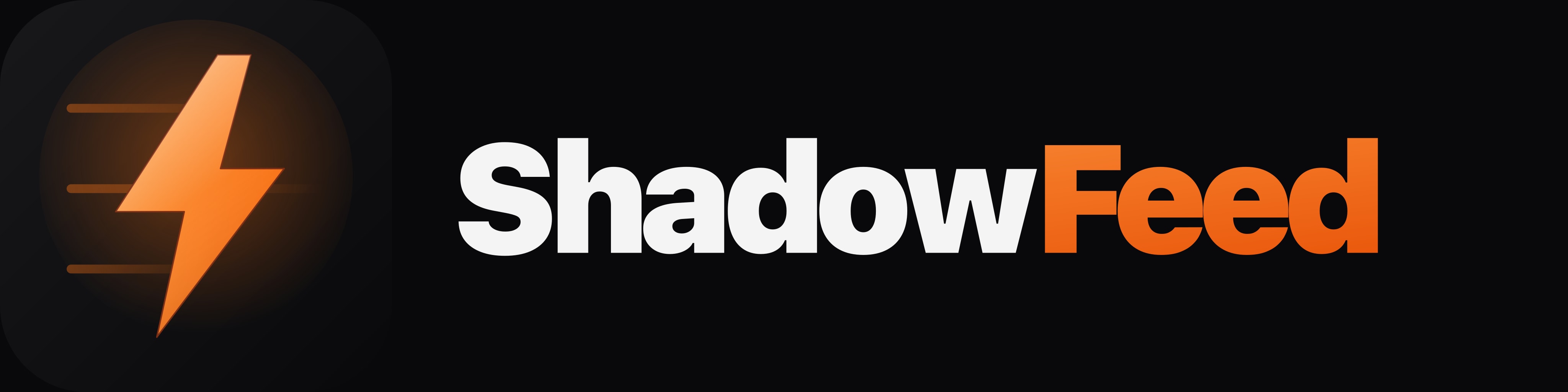
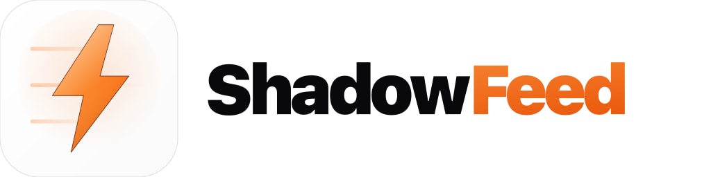
The ShadowFeed mark combines a lightning bolt — a nod to Bitcoin's speed and the x402 payment protocol — with three stacked feed lines representing streams of real-time on-chain intelligence. Use the primary mark on dark surfaces, the light mark on white or pale backgrounds, and the mono mark when color is not available.






Orange is ShadowFeed's signature — it represents the speed of micropayments and the warmth of the Bitcoin ecosystem. Anchor the brand in deep neutrals; reserve orange for emphasis and call-to-action. Click any swatch to copy its hex value.
ShadowFeed uses Inter for all UI and marketing copy — chosen for its excellent rendering across screens and weights. JetBrains Mono handles code, API responses, and on-chain data. Always use tight negative tracking on large display text.

Keep the mark legible, balanced, and contrasted. Preserve clear space around the logo equal to the height of the bolt. When in doubt, choose the primary dark mark on a neutral surface.
Give the mark room to breathe. Minimum padding = bolt height.
Never stretch, skew, or squash the mark. Scale uniformly.
Avoid saturated backgrounds that compete with the brand orange.
The mark is always upright. No angled or vertical orientations.
No drop shadows, bevels, outlines, or extra embellishments.
Use the light mark on white surfaces; the dark mark on dark.
ShadowFeed is built by engineers, for engineers — and the agents they deploy. We speak with precision, confidence, and a dry technical wit. We never oversell.
Grab the full asset kit — 6 logo variants × SVG / PNG / JPG at up to 4096 px. 3 MB zip.